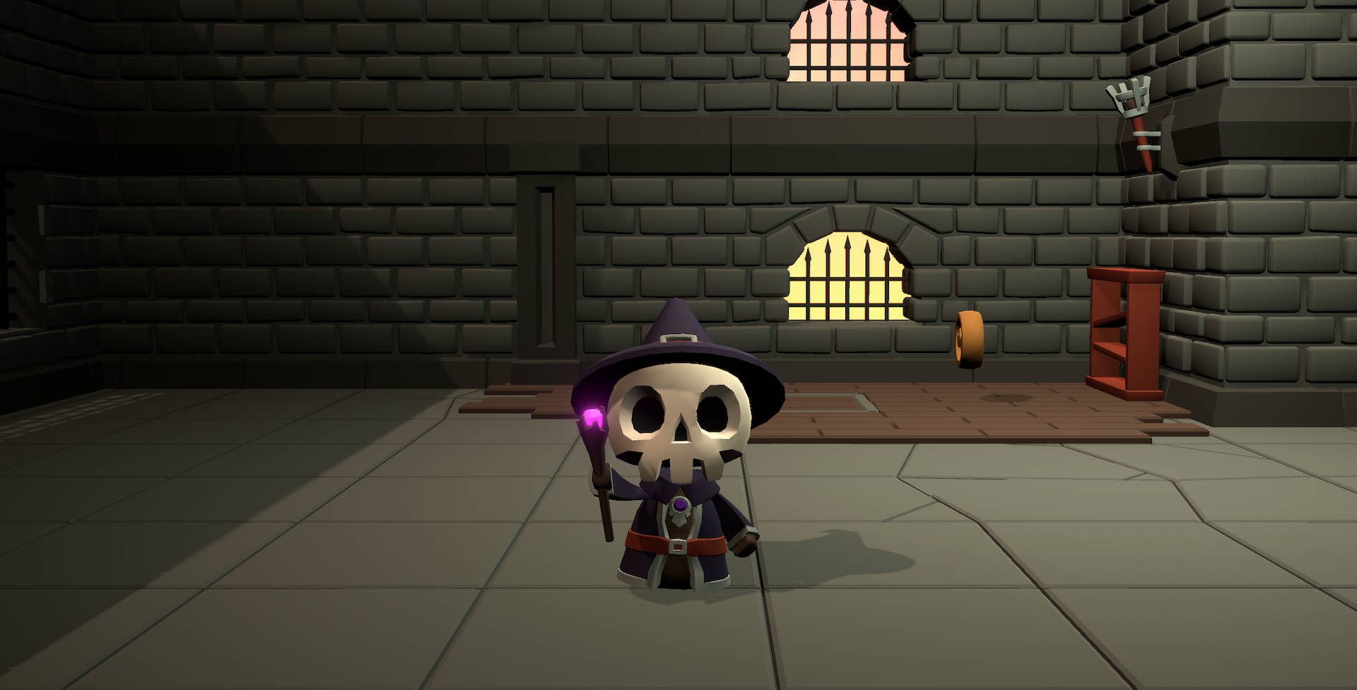
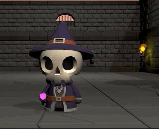
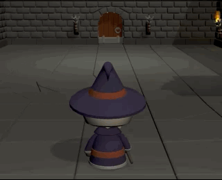
Working Title: Rhythmagic
Magical UI Upgrades
I had my nephew try out the prototype over Zoom and through his messing around saw just how unintuitive the gameplay was to someone going in cold without any tutorial. It wasn't so much as the action of casting spells itself was inaccessible (he's been playing a lot of Beat Saber so rhythm games weren't mysterious to him), it was just conceptually confusing. A couple of my notes after his play session:
- He couldn't visualize how to cast spells. My "the first button you press is your spell element" concept wasn't communicated anywhere in the design. As much as I hate to expose UI to the player, I needed a solution here.
- He relied heavily on the menu I threw together that had directions for each spell. The glyphs weren't as intuitive and easily learned as I had hoped. Part of this I assume is that they didn't make clear shapes due to repeating button presses, but it was also likely compounded with his not understanding the underlying spell system— he would try to cast a tornado starting with the south button instead of the north button for example.
Making the system visible
The first challenge was to bring some sort of UI element into the game that helps guide the player's spell casting in a way that helps them understand the underlying system. In my original sketches, I had glyphs that arranged themselves within a circle kind of like the sigils you see in Doctor Strange and other popular media. I returned to that concept but added circles to represent each button and placed an icon that matches the color and element related to each button.
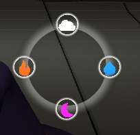
But since this is a rhythm game, there's an opportunity to make this a visual representation of the beat as well, so I animated the large bounding circle to expand and fade with the beat.
The hope is that this new visual makes it clear that if you start a spell with the west button, it's a fire spell, east is water and so on. Once you start your spell (after the first button press) the icons for the other buttons disappear. When you've completed a spell, the icons reappear because the next part of your spell may be a different element.
Integrating a Spell Menu
The original implementation of the spell menu was just to show anyone testing the game what spells they can cast. I really thought the spell glyphs would do the heavy lifting. But there were two major issues with the implementation:
- It was an overlay over the full screen, which required players to memorize what they had just seen and then implement it, which was really difficult.
- The instructions weren't based on the glyphs, so the system wasn't being reinforced. My nephew was saying "square, x, circle, triangle" out loud as he was trying to cast spells.
My first thought was to rethink the glyphs a bit. The most basic glyphs for fire and water needed to be simpler. Previously they had overlapping segments which is hard to visualize. I've still not solved how I'm going to handle spells that have overlapping segments, but for now I can at least simplify them so they're easier to remember and visualize. So now fire is a triangle pointing up and water is a triangle pointing down. I like the connection of the up-pointing triangle and the shape of a flame and the down-pointing triangle and the shape of a cross-section of a body of water or the idea that water fills any container.
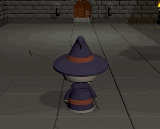
My next thought was borrow some inspiration from the anime Black Clover and add a floating spell book that the player can call up that holds all their spells and can display them as a reminder whenever the player needs. Sure, I could do a UI panel that slides up from the bottom of the screen, but I believe the more this stuff can be integrated into the game world, the more immersive it is. It goes back to my principle for meta-contextual layers: It's not for the player, it's for the character. So really, you're looking over the character's shoulder and seeing what they're looking at as they read their spell book.
The player calls up the spell menu with d-pad up and then cycles through spells with the left and right d-pad buttons.
Now that the player can call up the spell menu without a disruptive overlay, they can just follow it like a recipe.
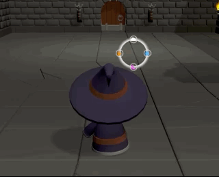
The player follows the process for generating a fireball from the spell menu
The ability to flip through spells until you find the right one and then follow the recipe to cast it feels very wizard-like. It hopefully helps to reinforce the spell system and help the player to visualize spells not as button presses or sequences, but as shapes they're drawing.
This also unlocks some gameplay potential. I can tell the player how many pages are in their spell book and only once they've discovered and cast a spell is it added to the book. So there could be an incentive to complete the spell book that encourages exploration and experimentation. Previously I thought of learning spells as a means to alter the environment in a way that allows for further progress, but now learning the spells could be progress as well.
Leave a comment
Log in with itch.io to leave a comment.